While the CEO of Zoom says their philosophy is all about serving their existing customers, it’s clear they haven’t focused on easily identifiable core problems with Zoom “Chat”.
Seeing this, I - along with a team of UX designers - endeavored to identify and solve Zoom Chat issues to convey a more modern and trustworthy experience.
Scope & Problems
What is Zoom?
The marketing material will tell you:
Zoom is the leader in modern enterprise video communications, with an easy, reliable cloud platform for video and audio conferencing, collaboration, chat and webinars across mobile devices, desktops, telephones and room systems.
The CEO promises you:
“Our philosophy is we really focus on making our existing customer happy. We truly believe if you do not make the existing customer happy, even if you get more new prospects, it may not be sustainable”
- CEO of Zoom
Skip to the finished product (well…finished for now)
Team
4 Designers
GA Student Project
Duration
2 Week Sprint
January 2021
Software
Adobe XD
Sketch
Miro
Challenge:
Improve a core feature in the digital experience of Zoom.
My Role:
As a lead UX Designer on this project, my role was:
Research
User interviews
Surveys
Synthesize
Affinity mapping
Personas
Design
Personas
User flows
Information Architecture
Wireframing
Prototyping
Research
8
Interviews
Conducting our interviews over Zoom was an eyeopening experience. We were able to see firsthand how our users navigate the features and functions of Zoom.
50
Survey Responses
My teammates and I sent out a google form through Linkedin, Facebook, and Slack. Additionally, each team member sent the form out to their friends and families. Our goal was to have a wide range of users to gain insight into all the types of zoom users and their pain points.
What did the users tell us?
92% of users use Zoom on their desktop/laptop
88% of Zoom users use the chat function
66% of users use both the “Everyone” and “Private” chat options
What functions and features do Zoom’s competitors offer?
The data we collected from our surveys and interviews guided us to a list of competitors. We learned from this analysis that Zoom is the only messaging system that puts all chats in the same feed.
Synthesis
User interviews and surveys revealed strong trends
Based on the substantial amount of data collected from our interviews and surveys, we created an affinity map. There were two main trends that appeared:
Users were frustrated that everyone and private messages appeared in the same feed.
Users were unable to navigate the save chat and upload file icons.
Who is our audience?
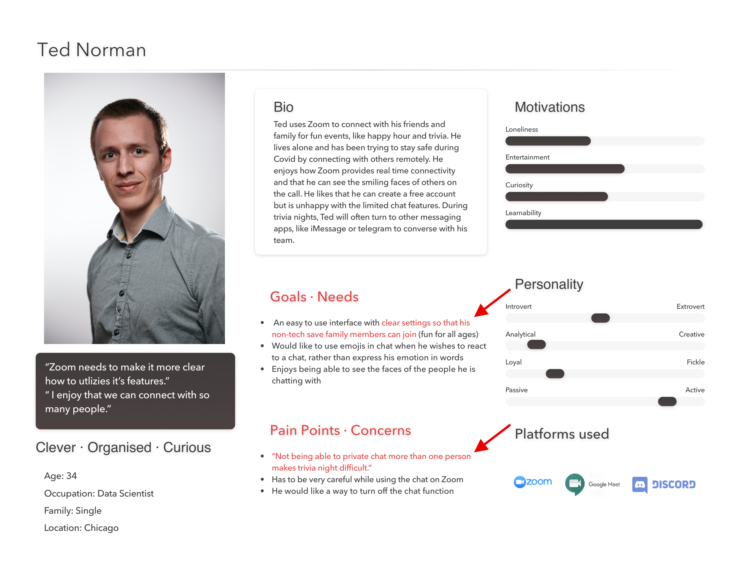
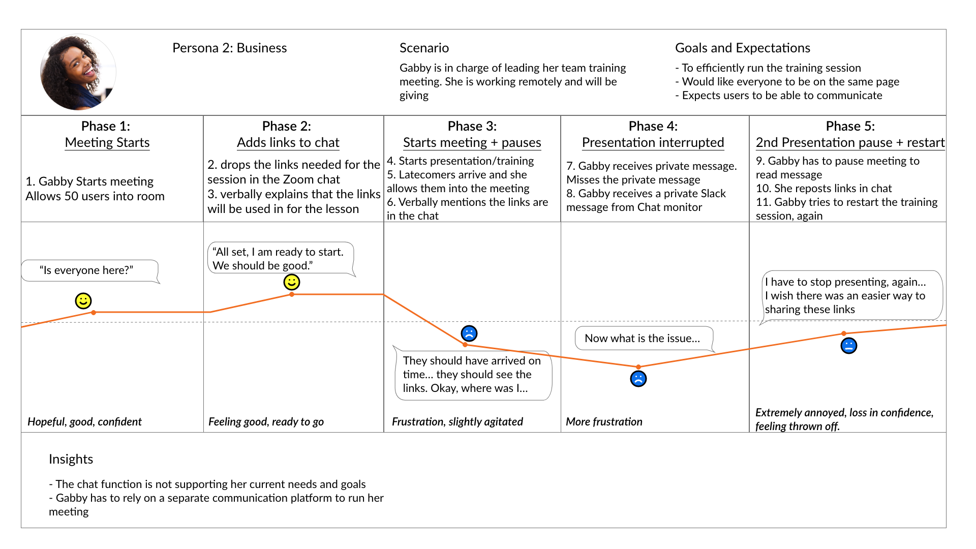
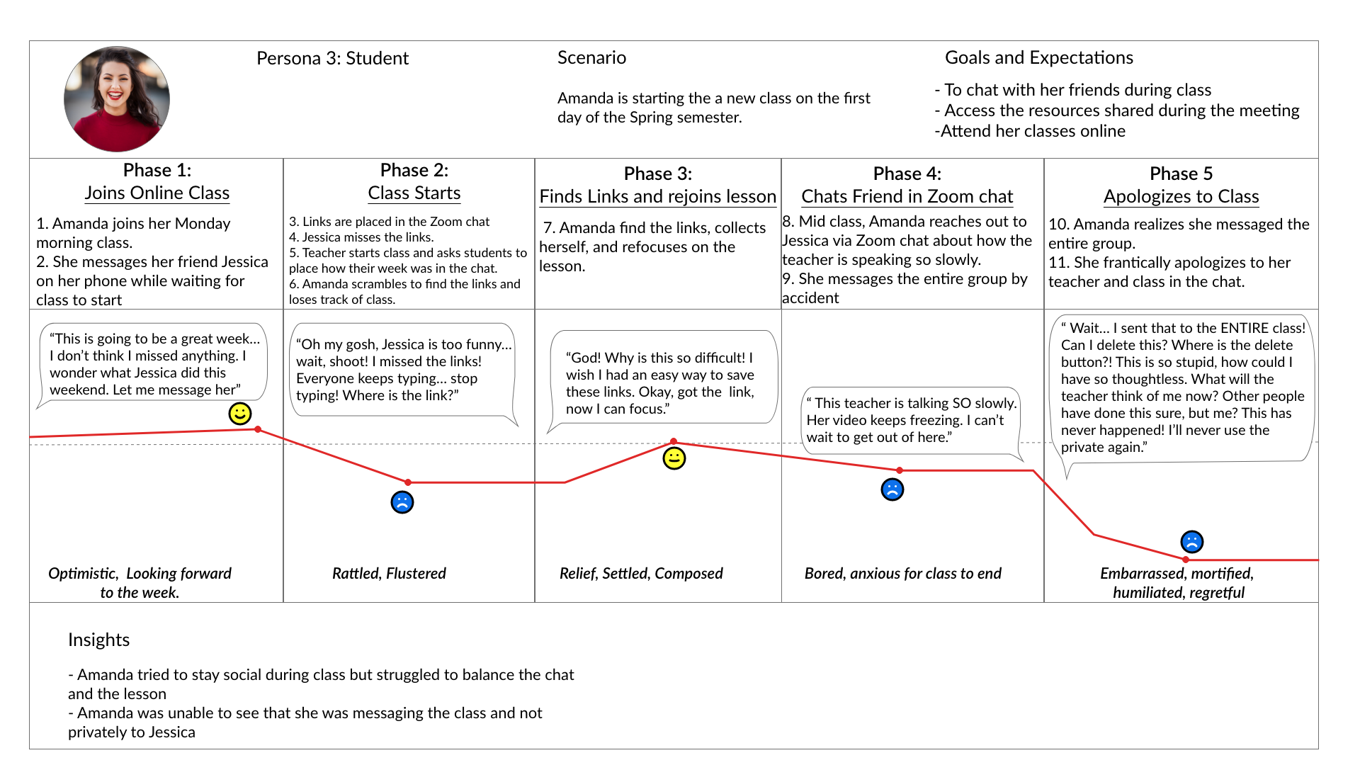
Insights gained from our synthesized data, led us to create Amanda, Gabby, and Ted. Amanda is our main user. Each persona experiences unique problems, but Amanda experiences ALL of the problems. We kept these users’ needs in mind as we determined the problem and began to ideate a solution.
Journey Maps
Journey maps help us better understand how the users are experiencing Zoom and their different emotional touch points. When they each reach their individual pain points, they are filled with embarrassment, frustration, panic, and distress.

What does the chat layout currently look like?
Viewing messages in the feed is a users only view and can not be re-segmented or customized.
Users must make effort to verify non-default message recipient.
“Saving” the chat is a feature which is hard to find.
Research Summary
What have we learned?
The Zoom chat is NOT intuitive
Risks:
Embarrassment
Frustration
Panic/Distress
Impact:
Zoom is NOT making its customers happy
Not aligning with their brand statement which leads to distrust
How can we fix this?
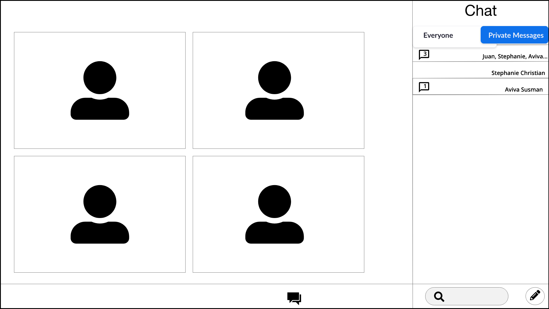
Separate “Everyone” vs "Private” feed layout.
Integrate conventional icons and accessible mechanisms for saving chat feeds and messages.
Design
Userflows
After we compiled and synthesized all of our data, we were ready to jump into the design phase. In order to guarantee a successful process for our users, we built out user flows. The user flows show the user’s tasks to operate the chat feature. The red circles represent the current-state and the green circles represent the designable solution. The flows are labeled by their task.
Send Message
Users were unable to have different messages in separate feeds
Users are able to separate everyone and private chats and additional private chats- all in different feeds
Save Chat
Added a clear save chat icon
Wireframes
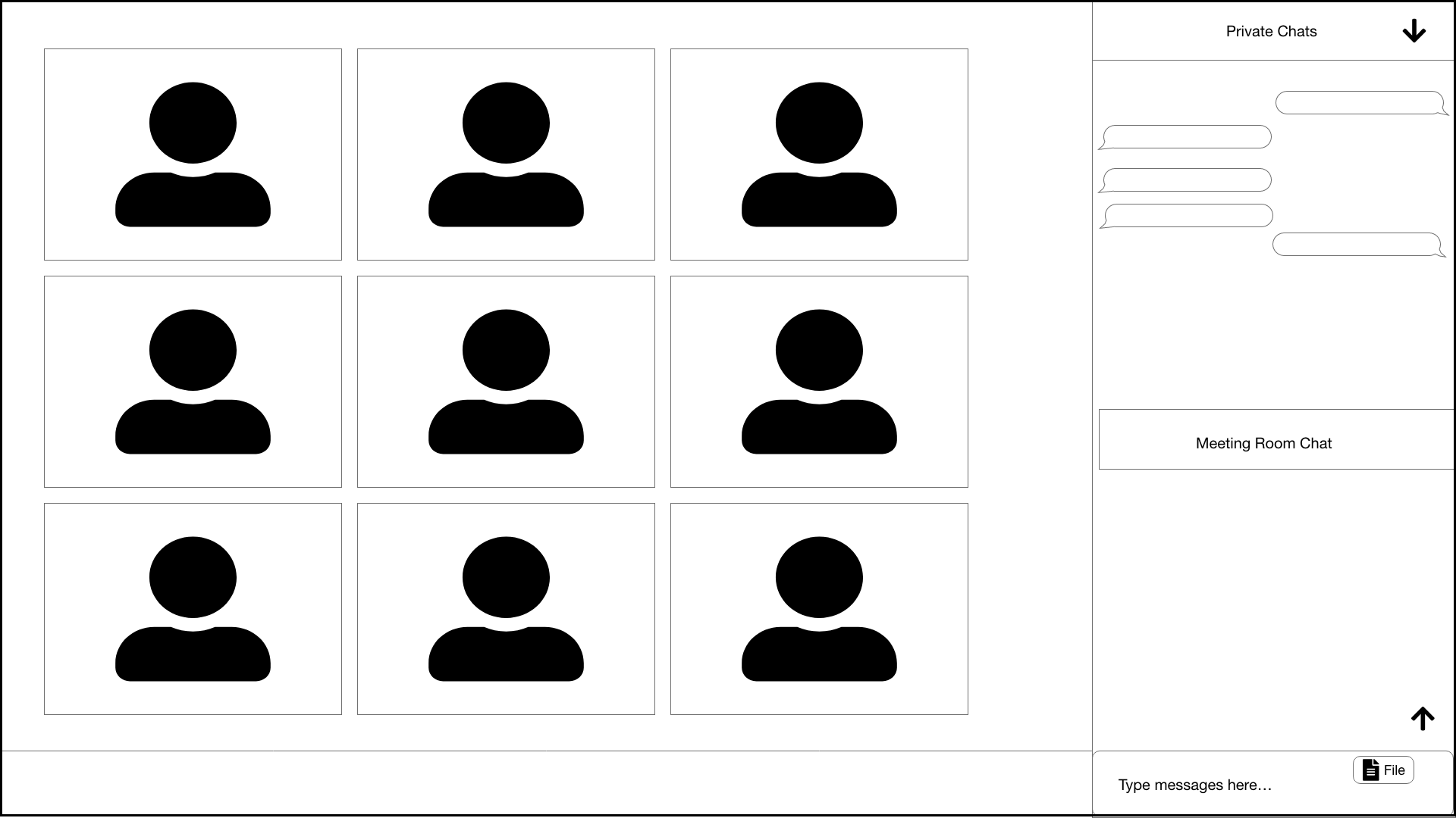
The layout for our chat box redesign came from user centered data. To make our designs come to life, we created low fidelity wireframes and conducted usability tests. We want to see what improvements would do to the user interface and then test it.
The redesigned Zoom chat feature went through 2 rounds of Usability Testing and 1 round of A/B Testing.
Usability Tests
Users liked the ability to toggle between chats
“Save chat” icon labeled as file was misleading
Users understood that a paper clip was representing the attach file feature
A/B Testing
As a result of usability tests, users requested the ability to see both chat feeds separately and simultaneously in the same chat window. (pictured in Design B)
Design A
Design B - New Design
What did we learn?
Users preferred Design A
When shown Design B, the users expressed that there was way too much going on
Users recognized the floppy disk as a save file button
Prototype
After adding the adjustments from user testing and the A/B test, my team and I developed the following prototype
Conclusions & Next Steps
Takeaways
Personal
As one who uses Zoom for 8+ hours a day five days a week, I came into this project with my own personal opinions about Zoom. A big lesson for me was to put my own thoughts aside and allow the user to pave the path. I was quite surprised at some of the information that we obtained. For instance, a user who used Zoom for many hours a day did not know that you can save a chat. Our goal was to revamp the chat system, but not to create an entirely new infrastructure.
The Process - How could we have done it better?
During the interview process, we conducted usability testing to see if our hypothesis of the chat function was correct. We may have asked leading questions in order to prove our hypothesis. Going forward, we would be more cautious to not ask any questions that may be too leading.
Zoom has another chat interface which is not connected to the video communications. We could have asked our users if they utilize it.
Initially, when our users mentioned that they would want a chat feed in which the “everyone” and “private” chats are viewed simultaneously, we were debating between ourselves to decide which design to go with. We did what we should have done and let the user make the decision. We should not have even thought about making the decision ourselves. Our first reaction should have been to bring it to the user.
The future
As we were doing our research, our users mentioned many other ideas which we would like to integrate in further iterations:
Integrating an emoji keyboard
The ability to move user profile pictures
Enhance notification feature with more visual and audio
Add “read” receipts to chat feed(s)
Add “search chat” function
Ability to turn notifications on/off
Chat “pin” feature
During our 2 week sprint, we chose to focus on the key main problems that our users were encountering. To further enhance those features, we would take these next steps:
Conduct a third round of usability testing
Gather more data through more interviews
Implement changes to the mobile interface
Build more personas to encompass all the various Zoom users
Increase accessibility according to WCAG-2.1/ADA Guidelines


